Project 2

17/5/2019 - 31/5/2019
Eunice Lo Set Tze (0334512)
Typography
Project 2 : Font Design
Lecture Notes
Week 7 : Tracking and kerning
17/5/2019
- 'Kerning' refers to the automatic adjustments of space between letters which always mistaken as 'letterspacing' (space in a word or sentence, referred as 'tracking')
 |
| The kerning difference between all these letters |
-Types of tracking :
Normal tracking
Loose tracking
Tight tracking
Normal tracking
Loose tracking
Tight tracking
 |
| First : univers 55, Top right : normal tracking, Bottom left : tight tracking, Bottom right : loose tracking |
- Flush left
Most closely mirrors the asymmetrical experience of handwriting. It starts at the same point but ends wherever the last word ends.
Example:
Lorem ipsum dolor sit amet, consectetur adipiscing elit. Ut nec neque id nunc posuere pellentesque ut vel purus. Quisque magna libero, egestas at diam posuere, porttitor vestibulum purus. Nunc vitae erat sed massa imperdiet fermentum vel id neque. In id arcu a neque euismod consectetur eu et dui. Quisque augue metus, posuere et ipsum eget, molestie bibendum purus. Quisque sodales viverra eros, nec tempus ipsum rhoncus sit amet. Pellentesque ipsum orci, eleifend ut eros vitae, pretium tincidunt sapien. Sed iaculis, ex in varius ornare, erat dui varius neque, vehicula laoreet justo nulla at ante.
- Centered
Imposes symmetry upon the text, assigning equal value and weight to both end of any line. Because centered type creates such a strong shape on the page, its important to amend line breaks so that the text does not appear too jagged.
Example :
Lorem ipsum dolor sit amet, consectetur adipiscing elit. Ut nec neque id nunc posuere pellentesque ut vel purus. Quisque magna libero, egestas at diam posuere, porttitor vestibulum purus. Nunc vitae erat sed massa imperdiet fermentum vel id neque. In id arcu a neque euismod consectetur eu et dui. Quisque augue metus, posuere et ipsum eget, molestie bibendum purus. Quisque sodales viverra eros, nec tempus ipsum rhoncus sit amet. Pellentesque ipsum orci, eleifend ut eros vitae, pretium tincidunt sapien. Sed iaculis, ex in varius ornare, erat dui varius neque, vehicula laoreet justo nulla at ante.
Emphasizes the end of the line opposed to its start. It's useful in situations where the relationship between image and text might be ambiguous without strong orientation.
Example :
Lorem ipsum dolor sit amet, consectetur adipiscing elit. Ut nec neque id nunc posuere pellentesque ut vel purus. Quisque magna libero, egestas at diam posuere, porttitor vestibulum purus. Nunc vitae erat sed massa imperdiet fermentum vel id neque. In id arcu a neque euismod consectetur eu et dui. Quisque augue metus, posuere et ipsum eget, molestie bibendum purus. Quisque sodales viverra eros, nec tempus ipsum rhoncus sit amet. Pellentesque ipsum orci, eleifend ut eros vitae, pretium tincidunt sapien. Sed iaculis, ex in varius ornare, erat dui varius neque, vehicula laoreet justo nulla at ante.
- The goal in setting the text type is to allow easy, prolonged reading.
Text size : Large enough to be read easily at arms length.
Leading : Text that is set too tightly encourages vertical eye movement. Type that is set too loosely creates striped patterns that distract the reader.
Line length : Good rule of thumb is to keep the line length between 35-65 characters.
Week 8
For this week we didn't had any lecture as Mr.Vinod allowed us to use the time to refine our fonts.
Week 9 : Indicating paragraphs
Pilcrow : 
 |
| Pilcrows are for indicating paragraphs |
Line space/ Leading : Ensures a cross-alignment across columns of text. If the line space is 12pt, then the paragraph space is also 12pt.
Standard indentation is the indent where the line spacing are same size or the point size of the text is same size
 |
| All the line spacing are of the same size |
In traditional typesetting, there are two types of gaffes :
- Widows = short line of type left alone at the end of a column of a text
- Orphans = short line of type left alone at the start of a column
 |
| Difference between orphan and widow |
Examples on highlighting texts :
 |
| Italic |
 |
| Bold |
 |
| Using san serif |
 |
| Colour |
Instructions
Project 2
Week 7
Firstly, Mr Vinod told us to analyze the letterforms of the specific font we choose and we are supposed to dissect it.
 |
| The dissection of m |
 |
| The dissection of p |
 |
| The dissection of v |
 |
| The dissection of e |
I decided to go for Univers 65 Bold as a reference for my font making and sketched out the design.
 |
| added serif in each letters |
After getting approved, I started to digitalized them but it wasn't well received as it look exactly alike as Univers font but with the serif.
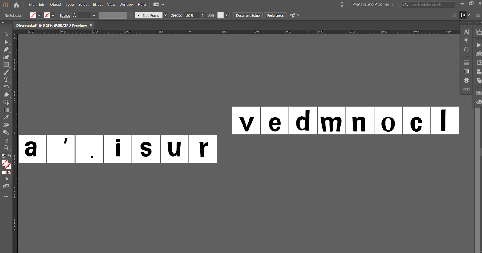
 |
| digitalized the letter v e d m n o c l a ' . i s u r which was given by Mr. Vinod |
After that, I start to distort them and achieved this and Mr.Vinod accepted it and told me to continue with this font
 |
| Distorted the shapes a bit to make it look not so ordinary |
Week 8
Then, I transferred them into Fontlab ver 5.2.1
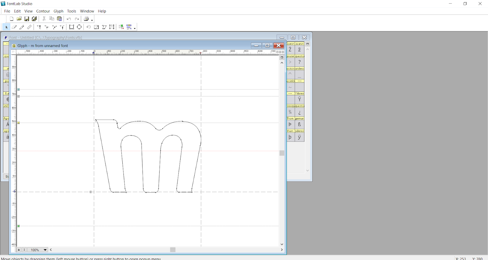 |
| Example of the letter in fontlab that I did |
 |
| Still having trouble with letter 'e' and 'd' as parts of the letters are missing, I seek for Mr. Vinod's help and it's still missing |
Week 9
Mr Vinod, then, told us to type out a sentence after finalizing our fonts. He toldus to use the full version of the fontlab and not the demo version as the demo version will have watermarks on our fonts.
 |
| I went to the Maclab to use the Fontlab and typed out the sentence given by Mr Vinod. and I adjusted the kernings |
After that Mr. Vinod did told us to make a layout and hand in the layout for the sentence as our final piece.
This is the embedded version of the layout I made :
Feedback
Week 7
Mr. Vinod : If you keep refining/exploring the character you might develop something interesting. Keep at it. Or you can use the current version also
Week 8
Mr Vinod said I should refine my initial design as he doesn't want it to be exactly alike as the font that I have chosen.He also said that the 'm' that I had designed should be changed as the middle part leg of the 'm' is a very wrong way to do.
Week 9
Mr Vinod said that he likes my font because it was unique. He said to make my ' and . thicker to match my other letters as it was too thin.
Reflection
Experience
During week 7, I think it was a bit hard for me as I didn't had any ideas on how to recreate the typeface I chose which was Univers and I didn't had any idea on how serif works on the font that I want to create. Week 8, I was having trouble as my idea was very vague and the font I created didn't have much of a difference. Week 9, I was actually happy that my outcome was very well accepted and received by Mr. Vinod.
Observation
Week 7, after lending a book on typography, I realized and learned about how serif works and I tried to add the serifs in a correct way. Week 8, I realized that after playing around with the distort settings, I came out with an idea and created something different compared to the previous one I have made. Week 9, I should be more confident next time and push myself to do my best again.
Findings
Week 7, I could've done better if I learned more and look more into the typeface I chose before starting on it. Week 8, I should have think harder and expose myself to how people recreate fonts in a better way to get some inspirations and ideas. Week 9, I should have not look down on myself and do the best I can and not having the mindset to keep on impressing people just to feel accepted.
Further Readings
17/5/2019 (Week 7)


24 /5/2019 ( Week 8 )


Comments
Post a Comment