Final Project

14/6/2019 -
Eunice Lo Set Tze (0334512)
Typography
Final Project : Expression, Hierarchy and Composition
Lecture Notes
Week 11 : Different Medium
Print type
- A good type for print is Caslon, Garamond, Baskerville ( characteristics : elegance and intellectual and highly readable when set to smaller sizes )
- They are also versatile and easy to digest


Screen type
- Typefaces are optimized and often modified to enhance readability and performance ( taller x-height, wider letterforms, more open counters, heavier thin strokes and serifs )
- Open spacing is important to also improve character recognition and readability
Pixel differentiation between devices

Static vs Motion
- Static has minimal characteristics in expressing words
- Bold and italic offers a fraction of the expressive potential
- Motion is a temporal media that offers typographers to "dramatize" types and for letterforms to become "fluid" and "kinetic"
 |
| Static |
 |
| Motion |
No lecture for this week as we are focusing on the final project
Instructions
Final Project
Week 11
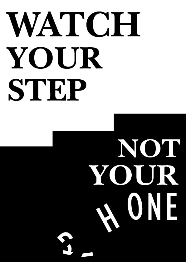
I started out with the quote "Watch Your Step, Not Your Phone" and drew a few sketches relating to the quote.
 |
| This was rejected as it is a bit too straightforward and Mr Vinod wanted lesser visuals and more on typography |
 |
| This was also rejected because of having too much visuals |
 |
| Composition is odd so it's not accepted |
 |
| Mr Vinod told me to digitalize this |
 |
| Then, Mr Vinod finds it too simple and not interesting |
Week 12
Then after that I tried making another one which is also a bit too simple for Mr Vinod and the typeface used is making it uninteresting.
 |
| Too simple |
So I tried digitalizing again
 |
| Me and my friends prefer this one but it was rejected by Mr Vinod as he said that the distortion is not satisfying |
And my final outcome for this project is this
 |
| Black and White ver |
 |
| Yellow and black ver |
And here is the embed version of the final outcome but in yellow and black version :
After that, I animated it

Feedback
Week 11
Mr Vinod wanted me to use more on typography instead of using visuals
Mr Vinod : Ok so, try not to put too many little ideas into your composition. You should have (preferably strong) idea in your work.
So right now you have 1) steps and 2) phone two ideas in one. Although the phone one is suppose to just indicate: not good, hence the line and the step one is pretty straightforward.
I would suggest seeing if you can produce any other idea before running with this.
Also your composition, needs to be better, so do look at references and be a little more expressive and experimental
Week 12
Mr Vinod said that my idea is there but it is not interesting and flat. He also said that my distortion of words is not satisfying to look at.
Week 13
Mr Shamsul said that my frames weren't enough as I did 2 frames only on the word 'PHONE' that was cracked, so I changed it and after that it's okay.
Reflection
Experience
During Week 11, I felt a bit frustrated and lack of confidence with myself as I felt like I couldn't live up to Mr.Vinod's expectations. During week 12, I still have that feeling and I was really stressed about it because the designs that I made, me and my friends loved it and preferred it but was not accepted by the lecturers.
Observations
During week 11, I realized that all this time, I had a huge feeling that I can't live up to the expectations given and this cause me to not be interested in the class anymore. During week 12, I feel like i just want to get this over with and do the best I can even though the artwork feels like a Grade C or B.
Findings
During week 11, I could've done better and try to explore more on what kind of artwork that can satisfy my lecturer and to calm down and not getting pissed off. During week 12, I should've get some rest and not think about how to not explode due to the pressure given.
Further Readings
Week 11

 |
| Rule of odds |
 |
| Rule of thirds |
The first part of the book is about the rule of odds. It stipulates that an odd number of elements in a composition is more interesting than having one or an even number as they appear natural than the symmetries. Using 3x3 grid structure in providing hotspots that creates active areas which are used as focal points. The next is the rule of thirds. It is a guide to image composition and layout. Locating key visuals in the active hotspots of a composition helps draw attention to them, giving an offset balance to the composition.
Week 12


This part of the book is about how Modernism was shaped by the industrialisation and urbanisation of the western society. Ti marks the departure from the rural and provincial towards cosmopolitanism. The process became key concerns as part of an attempt to move beyond the representation as depicted by cubism and bauhaus.


Comments
Post a Comment